Typography is an art that communicates feelings through designed letters. It’s also a style that determines how efficient the design is. It helps to create a connection or an experience. It’s more than just picking out the size or weight of the letters. There are many elements to consider for typography.
Did you know that:
- There is a difference between a typeface and a font. The former is a collection of fonts while the latter is a style within the collection. Case in point: Calibri is a typeface, and Calibri Light Italic is a font. If you often confuse the terms, don’t fret. Experts say that using the terms interchangeably is widely accepted these days.
- Certain fonts are trustworthy. Studies show that the most credible font is Baskerville. During several experiments, people have believed and shown more trust in information that is written in Baskerville than those set in Georgia, Helvetica or Trebuchet. As per David Dunning, a Cornell University professor, Baskerville has a credible reputation because it has a British sense of formality and earnestness.
- According to studies, fancy fonts are often associated with skill levels in certain professions. In one survey, diners assumed that the chef had more than average skill set when they received a menu with fancy fonts. Patrons who received a menu with basic fonts only characterized the chef with an average skill set.
- People with steadfast personality associate best with Times New Roman, Cambria, and Arial. Assertive people feel an instant connection with Rockwell Xbold, Rockwell, and Georgia. The creative types are more inclined towards Rage Italic, Kristen, and Gigi.
- For people with dyslexia, reading materials set in Helvetica, Arial, Verdana, Courier, and Computer Modern Unicorn are relatively easy to read. Sans-serif fonts with defined line spacing (1.5 or more) are dyslexia-friendly fonts.
- To acquire the most optimal reading speed online, keep the fonts at least 10 points or higher. Fonts like Verdana, Georgia, Arial, and Times New Roman are the best in terms of reading speed.
- The majority of road signs in America use the Clearview Hwy font. Studies show that it is the most legible font for both daytime and nighttime viewing.
- The sentence “The quick brown fox jumps over the lazy dog” is universally used as typefaces preview because it has all the letters of the alphabet.
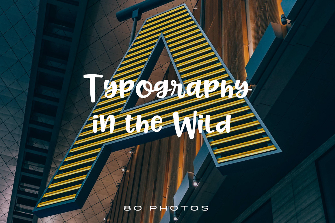
Regardless if you’re designing a project or not, here are some examples of typography in the wild that can inspire your work.
Download Typography in The Wild Photo Pack


