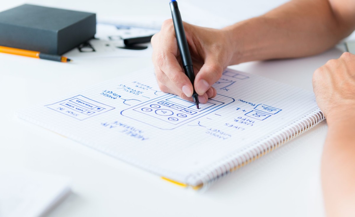
Today, the average person spends 2 hours and 51 minutes on their smartphones each day, looking at it roughly 221 times and touching its screen more than 2,600 times, as per a report from Dscout. On the other hand, 64% of learners find accessing their training content from a mobile device essential as claimed by Towards Maturity. These numbers are enough evidence to shed light on the digital transformation taking place via mobiles.
But, are your mobile learning content providers working hard enough for these users? With people checking their phones almost 10 times a day, non-responsive elearning or the one which fails to deliver quality experience is missing a trick. So, what are you waiting for?
Optimize your digital learning experience for the modern learner today taking help from some our design strategies mentioned below which should be implemented along with best practices of the same. Moreover, it is recommended to constantly be on the lookout for solutions for elearning content needs designed for mobile users who dominate the present day’s digital scenario.
Responsive Design for Mobile Elearning

Before providing information about the design strategies which must be adopted, you must understand that there’s a specific design, i.e. Responsive design which works best for mobiles. It means that your content adapts to the device and adjusts accordingly on the screen, it is viewed on.
Mobile Learning Strategies and Best Practices
The type of content which works best on mobile is the one which emphasizes on quick glance microlearning, simple interactions like polls, is interactive and engaging, i.e. has quizzes and video content. Keeping in mind these prerequisites of mobile learning, proceed towards the creation of strategies some of which are as mentioned below.
Plan ahead to save time and efforts
As already mentioned, responsive design is the way to proceed and mobile learning is futile without it. So, keep that in mind and consider your design needs at the beginning of the project itself. With this, you are also considering the needs of your audience and shall learn what learning experience will work best for them.
Start by determining the kind of mobile your learners are using and then create different test layouts and target them. For this, use the drop-down device located adjacent to the view mode slider. Do make sure to test the newly-created layouts before finalizing one as any technical glitches shall make the audience disinterested.
This practice of considering adaptive design right from the beginning shall also help save time and efforts.
Consider small screens for a mobile-friendly output

Once you’ve successfully captured the requirements of users, implement those knowledge gatherings at the design phase. For designing, there are certain points which must be kept in mind like firstly, the UI must be designed in a manner that content and other elements flow naturally. Consider long pages and fewer clicks as these work best.
Make sure that the course is designed keeping in mind the time your audience would like to stay on or access it. As per various data sources, the average session duration on mobiles is 10 minutes.
Apart from this, keep your design simple and clear focusing on the minimum number of clicks. Moreover, make sure that your key points stand out and the best way to do it is by including bullets, numbered points and different icons to grab the users’ attention.
Bid goodbye to large and complex interactions
Make sure to choose interactions wisely as these are next in line considering whether the ones chosen shall work across all screen sizes or not. Detailed and complex screen sizes work well on large screens like desktops which comprise an enormous amount of screen space, but these may lead to poor user experience if incorporated on mobile devices.
Hence, simple, short, and less detailed interactions are to be considered in case of mobile learning.
Alongside, minimize the frequency of drag and drop feature and limit the clickable areas so as to ensure better user experience.
Keep graphics simple and clear
![]()
Next up, keeping in mind the learners who shall access your content on different devices, you must steer clear of the images which might lose their quality on small screens. Hence, refrain from uploading too detailed or complicated images, infographics, diagrams as their details might get lost on a small screen thereby neglecting its purpose.
However, if complex images cannot be avoided at any cost you should upload them in a supporting PDF document so that users of small screens can save a version of it and view it later.
Apart from the aforementioned strategies, some of the other important guidelines which must be followed when designing mobile learning course are mentioned below for your reference.
- Present only the main material on the mobile platform thereby sticking to your course objective
- Avoid adding any unnecessary banners, IDs, buttons, copyright notices, legal writings, and logos in your course content
- Just include a ‘more’ button wherever necessary in order to provide some details pertaining to a topic
- Avoid distractions from the learning content by placing navigation controls, legal information or any other course-related information at the bottom
- Reduce dimensions of images as required
- Make graphics clickable if possible to visualize related content
- Use thumbnails to access large images and detailed text
- Design a single-column flow and avoid adding any sidebar articles or tables in a separate column to the left or right of the main content
Now that you’re completely armed with all the knowledge for designing any mobile learning course, get started with it already! Just keep in mind all the considerations mentioned above for different stages of your preparation and you’ll be able to get the most out of the program.
