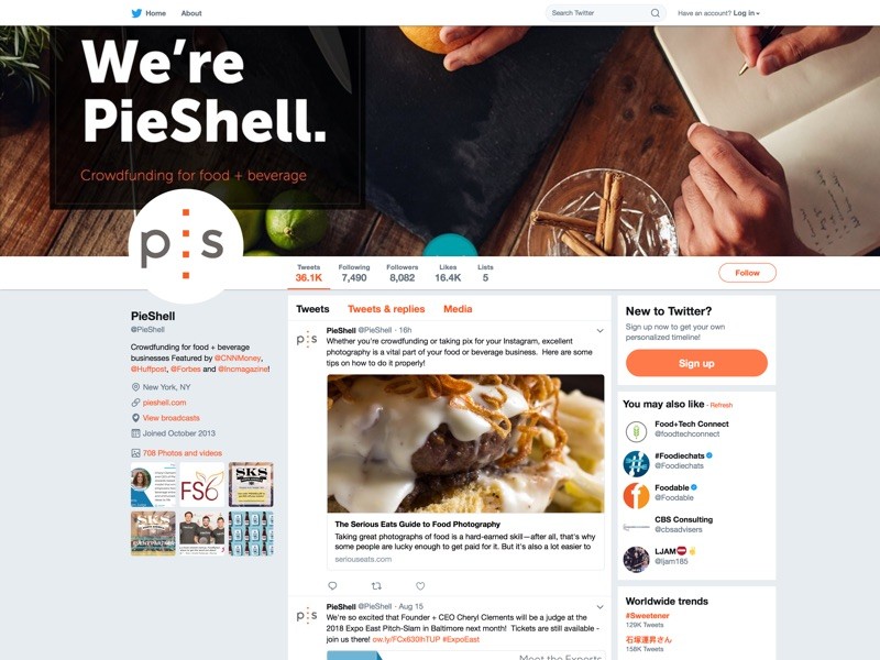
Social media cover is a photo placed at the top section a social media profile page, it is a simple tool that can be used to communicate with your audience, the audience can’t neglect it because it is the first thing they see when they visit your profile page.
Social media covers have been trending for a few years now, all the popular social media websites (such as Facebook, YouTube channel, Twitter etc.) have integrated it to help users in sharing more information and make social media more fun to use. Social Media covers are an important part of the branding tools you should always utilize.
It doesn’t require any technical skill to design a captivating and interactive social media cover, all that it requires is a simple photo in the right dimensions and right illustrations that share more information at a glance.
Common social media cover mistakes and how to correct them
There are hundreds of mistakes one could make while designing a social media cover, but not all are obvious to the audience as ones listed below, which you should make sure to avoid:
1. Too much information

What leads to social media design mistake most times is that people tend to cram more information into the design, it should not be so, media covers are meant to entice audience so that they will want to know more about you or your brand, not to share all information at a time. On Social Medias, you will find covers that feature too many product photos, addresses, other social media handles, and in some cases all of the above in just one cover image.
This leads to what is known as white noise, the human brain can’t or won’t take such loads of information at a time, and in the end, the social media cover is not effective for its usage. A simple theme image that matches the concept of your brand is enough to serve as your social media cover.
2. Wrong dimensions or orientation
Sometimes social media users do get a perfect design for their social media cover but fail to set it to the required dimensions or orientation. Firstly, social media covers should be in landscape orientation i.e. the width should be longer than the height.
Failure to set this right result in automatic cropping the cover photo to fit in and cropping may cut off a crucial part of the info you meant to share. Secondly, each social media website has its own dimension requirement for your cover to fit in just perfect. Listed below are ideal dimensions for popular social media;
- Facebook: 820 X 312
- Twitter: 1,500 X 500
- LinkedIn: 1,584 X 396
- Instagram: 1080 X 1920 (portrait orientation)
Visit https://sproutsocial.com/insights/social-media-image-sizes-guide to get more information on social media covers and other social images dimension.
3. Grainy or Blurry Design

Information on a social media cover should be clear and bold, if it contains text then the texts should be legible. What usually leads to this is the incorrect use of resolutions while designing the cover, the standard resolution for any web graphic should be between the range of 100dpi to 300dpi, anything below that range will result in grainy/blur output and anything above is meant for printable media. Make sure to always design your social media cover in higher definition.
4. Putting Logo on Logo
If you have ever noticed while seeing a cover photo, the profile picture is visible, so why incorporating your logo into the cover photo design again? You could just upload your logo as the profile picture while leaving space for other info to appear on your cover photo.
5. Re-using existing images

Designing an amazing social media cover should not be a hassle or shouldn’t cost much if you decide to outsource it, therefore, there shouldn’t be any reason to go on the internet to download a photo and set it as your social media cover.
Some brands even screenshot their website and upload it as social media cover, remember your cover is there to speak for you and it is the first thing audience see when visiting your page. Making use of existing images tells your audience that you are not genuine.
6. Social Media Cover is not the same as upcoming event photo
Every social media has its own design and layout and each one of them has a section to display or advertise an upcoming event. Too many people make the mistake of using social media cover to advertise an upcoming event which should not be so. Audience seeing this on your page sees you as unprofessional and this is already reducing your brand’s credibility.
7. Outdated Design
One of the greatest advantages of having internet around is that it helps us to follow up-to-date trends. Go online and look at how cover photos look like nowadays. Find similar brands to yours and see how they design their cover image, get ideas from them and design a better cover image for yourself.
Other tips to make your social media cover effective in engaging audience are mentioned below:
- Make sure your cover photo is visually consistent; the information should be cohesive, simple and in concept with your brand; dedicate more space to images and illustrations than texts.
- There is no law against changing your social cover photo once in a while.
- Once you change a social media cover image, view it with different devices such as desktop, laptop, and mobile devices, you do not know which kind of device audience will be using to access your page.
- You are not limited to still images, you can also make use of dynamic images such as GIF and short videos (not all platform support this).
- There are numerous online social media cover creators available, search them on Google and utilize them or at least the ideas generated from their templates.
There you have all you need to design an amazing and effective social media cover, remember your cover speaks for you, so say something meaningful with it.
If you ever got stuck on where to find a lot of high quality, professional and relevant images for your projects, Depositphotos is a good place to start. There you have the privilege to download any image for just $1, you can also create albums to organize your images.

